
How to Prepare for the PL-300 Exam?
Preparing for the PL-300 Microsoft Power BI Data Analyst Certificate exam? Don’t know where to start? This post is the PL-300 Certificate Study Guide (with links to each exam objective).
I have curated a list of articles from Microsoft documentation for each objective of the PL-300 exam. I hope this article will help you to achieve the Microsoft Certified Data Analyst Associate Certificate. Also, please share the post within your circles so it helps them to prepare for the exam.
Exam Voucher for PL-300 with 1 Retake
Get 40% OFF with the combo
Practice Tests for PL-300 Microsoft Power BI
| Udemy Practice Test | MS Power BI Analyst Practice Test (with code) |
| Amazon e-book (PDF) | Analyze data with Power BI |
PL-300 Analyzing Data with Microsoft Power BI
| Udemy | Analyzing Data with Microsoft Power BI |
| Pluralsight (Learning Path) | Microsoft Power BI for Analysts [Free Trial] |
Microsoft Power BI Projects
| Udacity (Nanodegree) | Data Analysis & Visualization with Power BI |
| Coursera Guided Project | Sales Analysis using Power BI |
| Datacamp (Interactive) | Introduction to Microsoft Power BI |
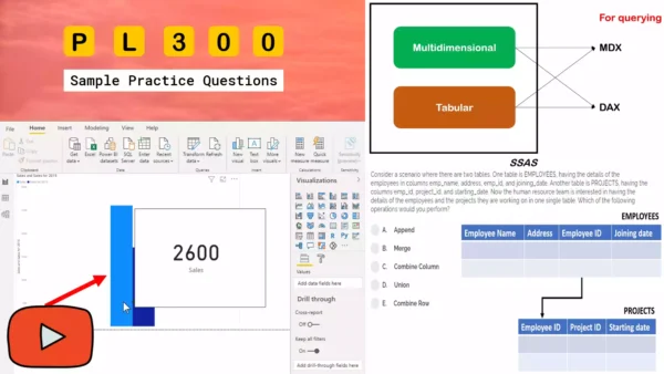
PL-300 Sample Practice Exam Questions
PL-300 vs. DA-100. What’s changed?
Most of the content topics are the same between PL-300 and DA-100. However, here are some differences:
Removed the section Profile the data (entire submodule)
Added AI visuals
Removed major part of the sections on Enhance reports to expose insights and Perform advanced analysis.
For more details check out my PL-300 vs. DA-100 video.
Check out all the other Power Platform certificate study guides
Prepare the Data (15-20%)
Get Data from Different Data Sources
Identify and connect to a data source
Data sources in Power BI desktop
Connect to data in Power BI desktop
Change data source settings
Select a shared dataset or create a local dataset
Where your workbook file is saved makes a difference
Select a storage mode
Storing data in the Power BI file
Use Microsoft Dataverse
Change the value in a parameters
Specify parameters for the data source in Power BI
Edit parameter settings in the Power BI service
Connect to a data flow
Configure and consume a dataflow
Clean, Transform, and Load the Data
Profile the data
Using the data profiling tools
Column Profiling in Power BI Desktop
Resolve inconsistencies, unexpected or null values, and data quality issues
Inconsistencies with date-type fields
Tips & tricks for creating relationships in Power BI Desktop
Relationships in Power BI Desktop when the data has null or blank values
How to Spot and Improve Data Quality in Power BI
Identify and create appropriate keys for joins
Model relationships in Power BI Desktop
Evaluate and transform column data types
Evaluate & change column data types
Shape and transform tables
Shape & combine data in Power BI Desktop
Combine queries
Apply user-friendly naming conventions to columns and queries
Data import best practices in Power BI
Configure data loading
Resolve data import errors

Amazon link (affiliate)
Model the Data (30-35%)
Design a Data Model
Define the tables
Tables in Power BI reports and dashboards
Configure table and column properties
Adjust the column width of a table
Design and implement role-playing dimensions
Define a relationship’s cardinality and cross-filter direction
Design a data model that uses a star schema
Understand star schema and the importance for Power BI
Power BI: Star schema or single table
Create a common date table
Common Date Filter for Multiple Tables
Develop a Data Model
Create calculated tables
Create calculated tables in Power BI Desktop
Test your knowledge of Calculated tables
Q] This question is part of a series of questions that present the same scenario. Each question in the series contains a unique solution that might meet the stated goals. Some question sets might have more than one correct solution, while others might not have a correct solution.
An employee works with a data model with tables and relationships defined below.
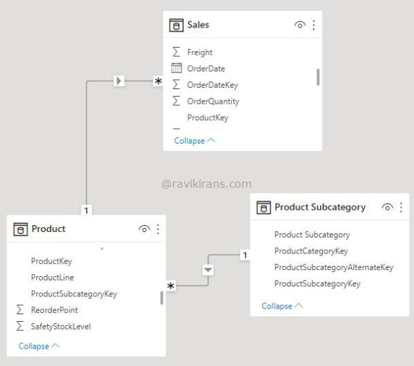
He creates a 2-column calculated table [Product subcategory, Average Sales] that returns only the product subcategories whose average sales are higher than the average sales of all the products. He has to complete the below DAX expression:
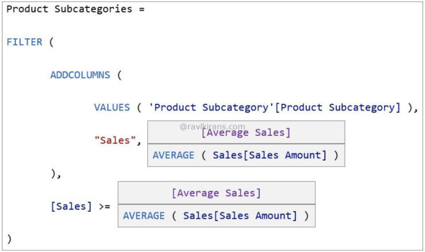
Solution: He chooses [Average Sales] and [Average Sales] in the 1st and 2nd boxes, respectively.
Does the solution solve the problem?
- Yes
- No
Explanation:
Recall the golden rule on context transition from Practice Test 1:
If you use the CALCULATE function in a row context, context transition is automatic.
Since ADDCOLUMNS evaluates the expression in a row context, using an explicit or implicit (introduced by a measure) CALCULATE function will force context transition to happen. i.e., row values of Product subcategory in the virtual table filter columns of the Sales table.
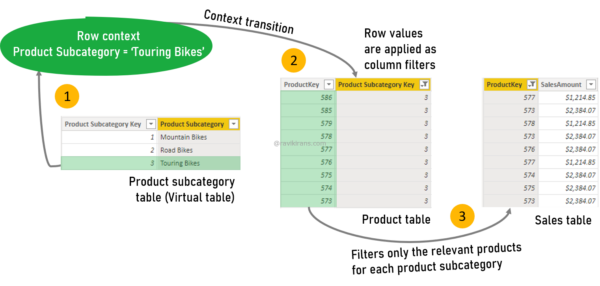
- Using a measure (where CALCULATE is implicit) in a row context will force context transition.
- The row value (Touring Bikes) filters the Product table for the relevant Product subcategories.
- The filtered Product table filters the Sales table for the related products.
So, [Average Sales] will calculate only the average sales of the specific product subcategories. [Average Sales] does go into the 1st box.
To achieve the desired result, we only need to return product subcategories whose average sales are higher than the average sales of all products.
Since the outer FILTER function too is an iterator, it evaluates the filter expression in row context. So, using the measure [Average Sales] in the 2nd box will force context transition (for the same reason above) and return the average sales of the currently iterating product subcategory.
In the filter expression, the average sales of any subcategory are compared with itself. Since the operator in the expression is >=, we get all the product subcategories. There is no filter happening here.
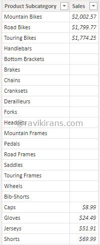
The blank rows are because the products in these product subcategories do not have any records in the Sales table.
So, selecting [Average Sales] in the 2nd box is incorrect. The given set of choices doesn’t completely solve the problem. Option No is the correct answer.
Reference Link: https://www.sqlbi.com/articles/understanding-context-transition/
Note: When beginning with DAX, similar to SQL, it is helpful to think as one table filters the other via relationships. But, as you learn more about DAX, you should be able to think in terms of expanded tables (and not relationships).
Reference Link: https://www.sqlbi.com/articles/expanded-tables-in-dax/
Knowledge Area: Model the data
This question is part of my course PL-300 Exam Questions. It is copyrighted and cannot be reproduced elsewhere without permission.
Create hierarchies
Create a hierarchy in Power BI
Create calculated columns
Create calculated columns in the Power BI desktop
Implement row-level security roles
Restrict data access with RLS for Power BI Desktop
Use the Q&A feature
Use Power BI Q&A to explore your data & create visuals
Q&A for Power BI business users
Create Model Calculations by Using DAX
Create basic measures by using DAX
Create & use your own measures
DAX: Use variables to improve your formulas
Use CALCULATE to manipulate filters
DAX: Avoid using FILTER as a filter argument
Implement Time Intelligence using DAX
Time intelligence in Power BI desktop
Replace implicit measures with explicit measures
Explicit vs, implicit DAX measures in Power BI
Use basic statistical functions
Create semi-additive measures
Semi additive measures in DAX for Power pivot
Use quick measures
Use quick measures for common calculations
Test your knowledge of Quick Measures
Q] You analyze sales data of a sports equipment company. You observe a lot of fluctuations in the data, such as low sales mid-week and high sales on Friday and Saturday.
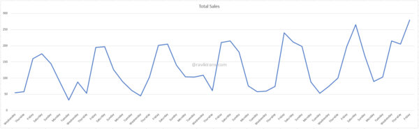
Your manager asked you to create a quick measure for the weekly rolling average to smooth out daily fluctuations.
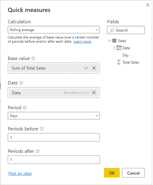
How would you complete the quick measure?
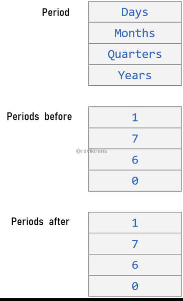
- Days, 7, 7
- Days, 6, 6
- Days, 6, 0
- Days, 7, 0
- Days 7, 1
Explanation:
For calculating the weekly rolling average, the Period has to be Days.
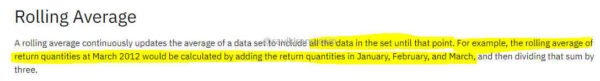
Rolling averages include data until the current period (in this case, the day) for calculation.
Reference Link: https://www.ibm.com/docs/en/cognos-analytics/11.1.0?topic=dimensionally-rolling-moving-averages
It makes sense, as in a weekly rolling average calculation, you do not want a blank value for the first date in the table. For January 1, Total Sales and the Total Sales rolling average is 55. If the rolling average calculation does not include the current period, January 1 would have blank values.
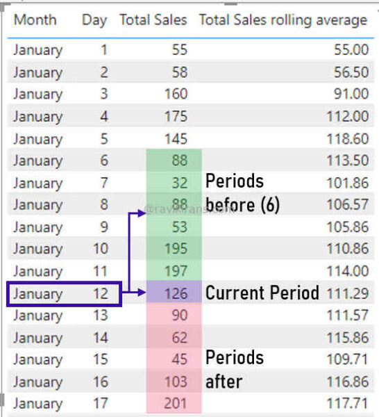
Since rolling averages already include the current period, for a weekly (7-day) rolling average, the Periods before should be 6. And, Periods after should be 0 since we do not want to include future dates into the calculation.
Option Days, 6, 0 is the correct answer.
Reference Link: https://docs.microsoft.com/en-us/power-bi/transform-model/desktop-quick-measures
Knowledge Area: Model the data
This question is part of my course PL-300 Exam Questions. It is copyrighted and cannot be reproduced elsewhere without permission.
Optimize Model Performance
Remove unnecessary rows and columns
Delete records or rows if the blank field
Remove Columns from Tables in Power BI
Identify poorly performing measures, relationships, and visuals
Table relationship causes severe performance drop
Power BI Desktop Visuals slow load
Reduce cardinality levels to improve performance
Optimize high cardinality columns in VertiPaq
Visualize and Analyze the Data (25-30%)
Create Reports
Add visualization items to reports
Add visuals to a Power BI report
Choose an appropriate visualization type
Visualization types in Power BI
Format and configure visualizations
Getting started with the formatting pane
Use a custom visual
Apply and customize a theme
Use report themes in Power BI Desktop
Use dashboard themes in the Power BI service
Configure conditional formatting
Use conditional formatting in tables
Apply slicing and filtering
Add a filter to a report in Power BI
Configure the report page
Change the display of a report page
Use the Analyze in Excel feature
Start in Power BI with Analyze in Excel
Choose when to use a paginated report
When to use paginated reports in Power BI?
Create Dashboards
Manage tiles on a dashboard
Edit or remove a dashboard tile
Configure mobile view
Optimize a dashboard for mobile phones
Use the Q&A feature
Add a Quick Insights result to a dashboard
Run and view insights on dashboard tiles
Apply a dashboard theme
Use dashboard themes in the Power BI service
Pin a live report page to a dashboard
Add a new dashboard tile is by pinning an entire report page
Enhance Reports for Usability and Storytelling
Configure bookmarks
Bookmarks in Power BI desktop to share insights & build stories
Create custom tooltips
Customize tooltips in Power BI desktop
Edit and configure interactions between visuals
Change how visuals interact in a Power BI report
Configure navigation for a report
Make navigation easier with Power BI buttons
Apply sorting
Sort by column in Power BI Desktop
Configure Sync Slicers
Sync & use slicers on other pages
Group and layer visuals by using the selection pane
Power BI: Explore the new selection pane feature
Drilldown into data using interactive visuals
Drill mode in a visual in Power BI
Export report data
Export data from a visual in a report
Design reports for mobile devices
Optimize Power BI reports for the mobile app
Power BI Design for Mobile Device
Identify Patterns and Trends
Use the Analyze feature in Power BI
Use the Analyze feature to explain fluctuations in report visuals
Identify outliers
Identify outliers with Power BI visuals
How to detect anomalies & outliers In your data
Choose between continuous and categorical axes
Customize X-axis and Y-axis properties
Use groupings, binnings, and clustering
Use grouping and binning in Power BI desktop
Implement clustering in Power BI
Use AI visuals
Work with AI visuals in Power BI
Use the Forecast feature
Create reference lines by using the Analytics pane
Deploy and Maintain Assets (20-25%)
Manage Files and Datasets
Identify when a gateway is required
Power BI Gateway – A complete guide covering all the major aspects
Configure a dataset scheduled refresh
Configure row-level security group membership
Power BI Row-level Security Groups
Row-level security using AD groups
Providing access to datasets
Build permission for shared datasets
Manage global options for files
Change settings for Power BI report
Manage Workspaces
Create and configure a workspace
Create the new workspaces in Power BI
Manage your workspace in Power BI & Microsoft 365
Assign workspace roles
Configure and update a workspace app
Publish, import, or update assets in a workspace
Apply sensitivity labels to workspace content
How to apply sensitivity labels in Power BI?
Configure subscriptions and data alerts
Subscribe to a report or dashboard
Subscribe yourself to reports & dashboards
Set data alerts in the Power BI service
Promote or certify Power BI content
Promote your reports, dashboards, & apps
Endorsement – Promote & certify Power BI content
This brings us to the end of the PL-300 Microsoft Power BI Data Analyst Study Guide.
What do you think? Let me know in the comments section if I have missed out on anything. Also, I love to hear from you about how your preparation is going on!
In case you are preparing for other Power Platform certification exams, check out the Power Platform study guides for those exams.
Follow Me to Receive Updates on PL-300 Exam
Want to be notified as soon as I post? Subscribe to the RSS feed / leave your email address in the subscribe section. Share the article to your social networks with the below links so it can benefit others.