
Welcome to the PL-300 Official Practice Test – Part 1.
In this part, I have given my detailed explanations to the 10 official questions from Microsoft. Unlike on the Microsoft website, the explanations include screenshots and .pbix files to help you prepare for the PL-300 exam.
With that being said, these tests are very simple, and they should only be used to brush up on the basics. The real exam would rarely be this easy. To get more rigorous practice and even in-depth knowledge, check out my PL-300 practice tests.
Watch this space for PL-300 questions Part -2 and an accompanying YouTube video to be published soon.
Q1] You plan to create a report in Power BI Desktop.
You need to create a visualization that displays data in two or more dimensions and cross-highlights with other visuals on the same report page.
Which type of visualization should you use?
a. Card
b. Matrix
c. Scatter
d. Table
A table is a flat, two-dimensional structure because it organizes data in horizontal rows and vertical columns without any aggregation and often includes duplicate values. Each cell in the table represents a unique intersection of a row and a column.
A matrix is a three-dimensional structure because it includes rows, columns, and aggregated values.
Reference Link: https://learn.microsoft.com/en-us/power-bi/visuals/desktop-matrix-visual
A card visualization displays only a single data point.
Reference Link: https://learn.microsoft.com/en-us/power-bi/visuals/power-bi-visualization-card?tabs=powerbi-desktop
A scatter chart displays data along the X and Y axis showing the relationship between the two numerical values. A scatter chart is strictly 2-dimensional until you add a third data dimension, at which point it transitions to a bubble chart.
Reference Link: https://learn.microsoft.com/en-us/power-bi/visuals/power-bi-visualization-scatter?tabs=powerbi-desktop
So we can conclude that of the given options, only the matrix visual is three-dimensional. Further, visuals like scatter charts, cards, and table visuals can only be cross-filtered. But if you have a column or a bar chart visual, then the matrix visual can cross-highlight it.
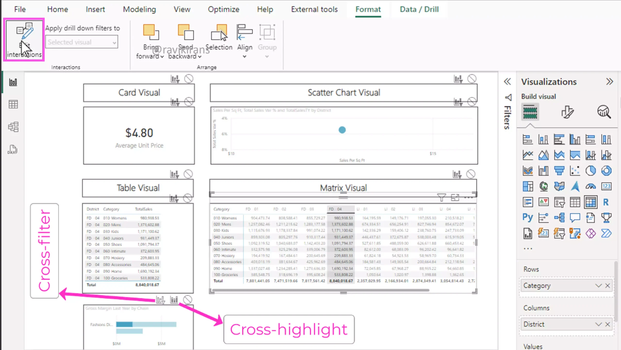
You can view which visuals can be cross-filtered or cross-highlighted by turning on the Edit interactions under the Format section.
Option Matrix is the correct answer.
Q2] You plan to create a report in Power BI Desktop.
You need to create a visualization to display a running total. The solution must meet the following requirements:
1] The initial and the final value columns must start on the horizontal axis.
2] The intermediate values must be floating columns.
Which type of visualization should you use?
a. Combo
b. Funnel
c. Scatter
d. Waterfall
In a waterfall chart, The initial and final value columns are often configured to always start from the horizontal axis. And the intermediate values are floating columns. So waterfall is the correct answer.
Reference Link: https://learn.microsoft.com/en-us/power-bi/visuals/power-bi-visualization-waterfall-charts?tabs=powerbi-desktop
A combo visualization is a single visualization that combines a column chart and a line chart.
A funnel chart helps you visualize a linear process that has sequential, connected stages, where items flow sequentially from one stage to the next.
Reference Link: https://learn.microsoft.com/en-us/power-bi/visuals/power-bi-visualization-funnel-charts?tabs=powerbi-desktop
A scatter chart displays data along the horizontal and the vertical axis showing the relationship between the two numerical values
Reference Link: https://learn.microsoft.com/en-us/power-bi/visuals/power-bi-visualization-scatter?tabs=powerbi-desktop#create-a-scatter-chart
Q3] You plan to create a report in Power BI Desktop that will display sales opportunities by five sales stages, including lead, prospect, qualified, committed, and transacted.
You need to identify the type of visualization that will display a linear process with sequentially connected stages, with one stage transitioning to the next.
Which visualization should you use?
a. Funnel
b. Slicer
c. Treemap
d. Waterfall
As we just discussed in the previous question, a funnel chart can help you visualize a linear process that has sequential, connected stages, where items flow sequentially from one stage to the next.
Here each funnel can represent the sales stage with the lead stage being the largest representing 100% of the sales customers. Each subsequent stage like the prospect, qualified, committed, and transacted is smaller than the previous one as fewer and fewer customers complete the subsequent stages in the sales journey.
Option funnel is the correct answer.
Reference Link: https://learn.microsoft.com/en-us/power-bi/visuals/power-bi-visualization-funnel-charts?tabs=powerbi-desktop
A waterfall chart is best used to display how a measure changes as values are added or subtracted. For example, how does net revenue become net income after adding and subtracting a series of items like tax, interest payments, etc.,
Reference Link: https://learn.microsoft.com/en-us/power-bi/visuals/power-bi-visualization-waterfall-charts?tabs=powerbi-desktop
Slicers are visuals that allow you to filter other visuals in the report.
Reference Link: https://learn.microsoft.com/en-us/power-bi/visuals/power-bi-visualization-slicers?tabs=powerbi-desktop#create-a-slicer
A tree map visual displays hierarchical data as a set of nested rectangles. Each outer colored rectangle represents a category, for example, the territory, with the size of the rectangle proportional to a measure such as total sales.
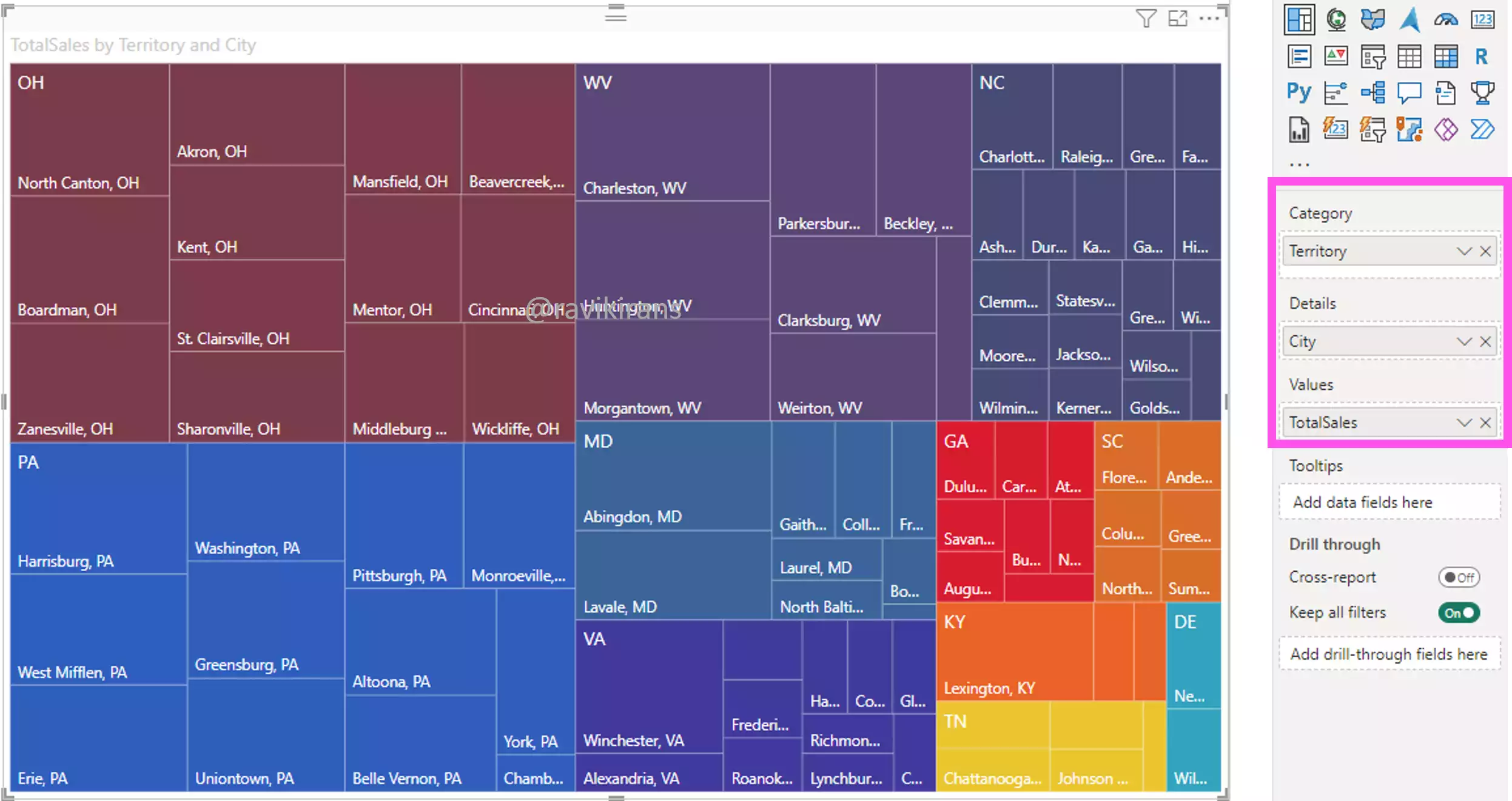
And, the inner rectangles are subcategories, for example, the city, that display the total sales contribution for each city to its territory.
Reference Link: https://learn.microsoft.com/en-us/power-bi/visuals/power-bi-visualization-treemaps?tabs=powerbi-desktop
Q4] You need to create a custom R visual by using Power BI Desktop.
What do you need to do first?
a. Configure global R scripting options in Power BI Desktop.
b. Enable preview features in Power BI Desktop.
c. Enable the script visuals option in the Visualization pane of Power BI Desktop.
d. Install R on your computer.
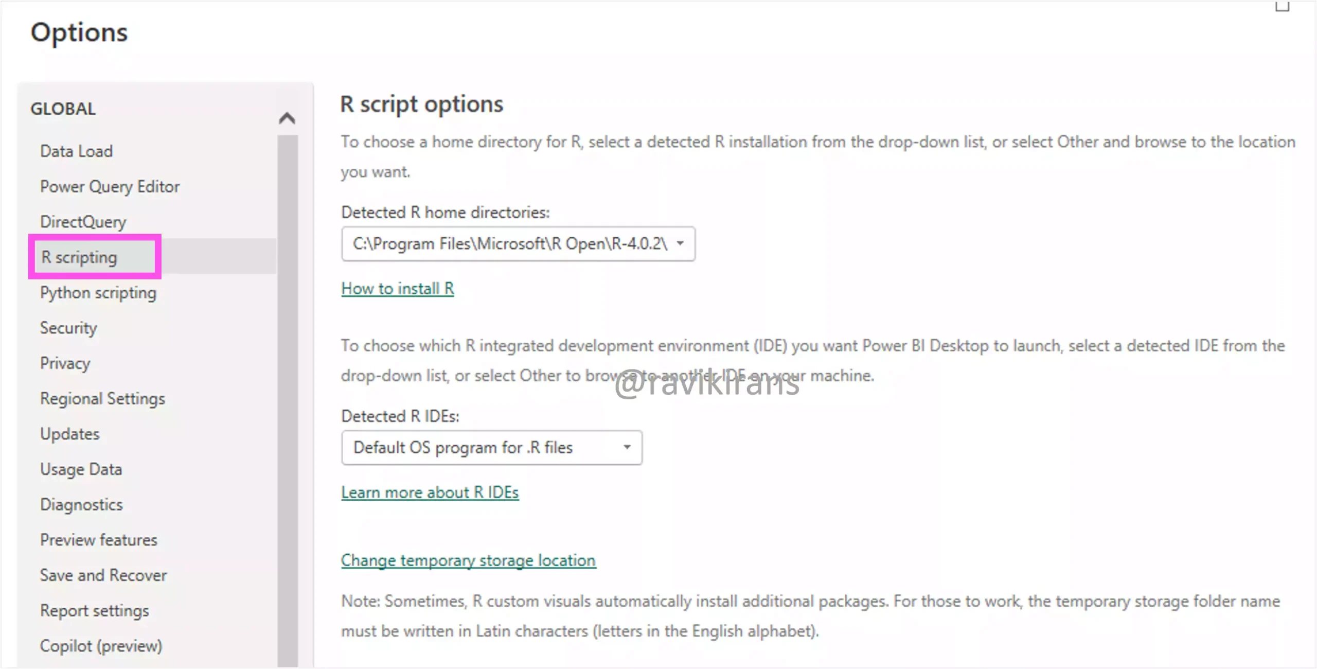
By default, Power BI Desktop doesn’t include, or install the R engine. To run R scripts in Power BI Desktop, first, you must install R on your computer by downloading from the CRAN Repository.
So the first step is to install R on your computer, which is the correct answer.
Reference Link: https://learn.microsoft.com/en-us/power-bi/create-reports/desktop-r-visuals
https://cran.r-project.org/bin/windows/base
After you install R, you can navigate to options and settings in Power BI Desktop and configure the global R scripting options.
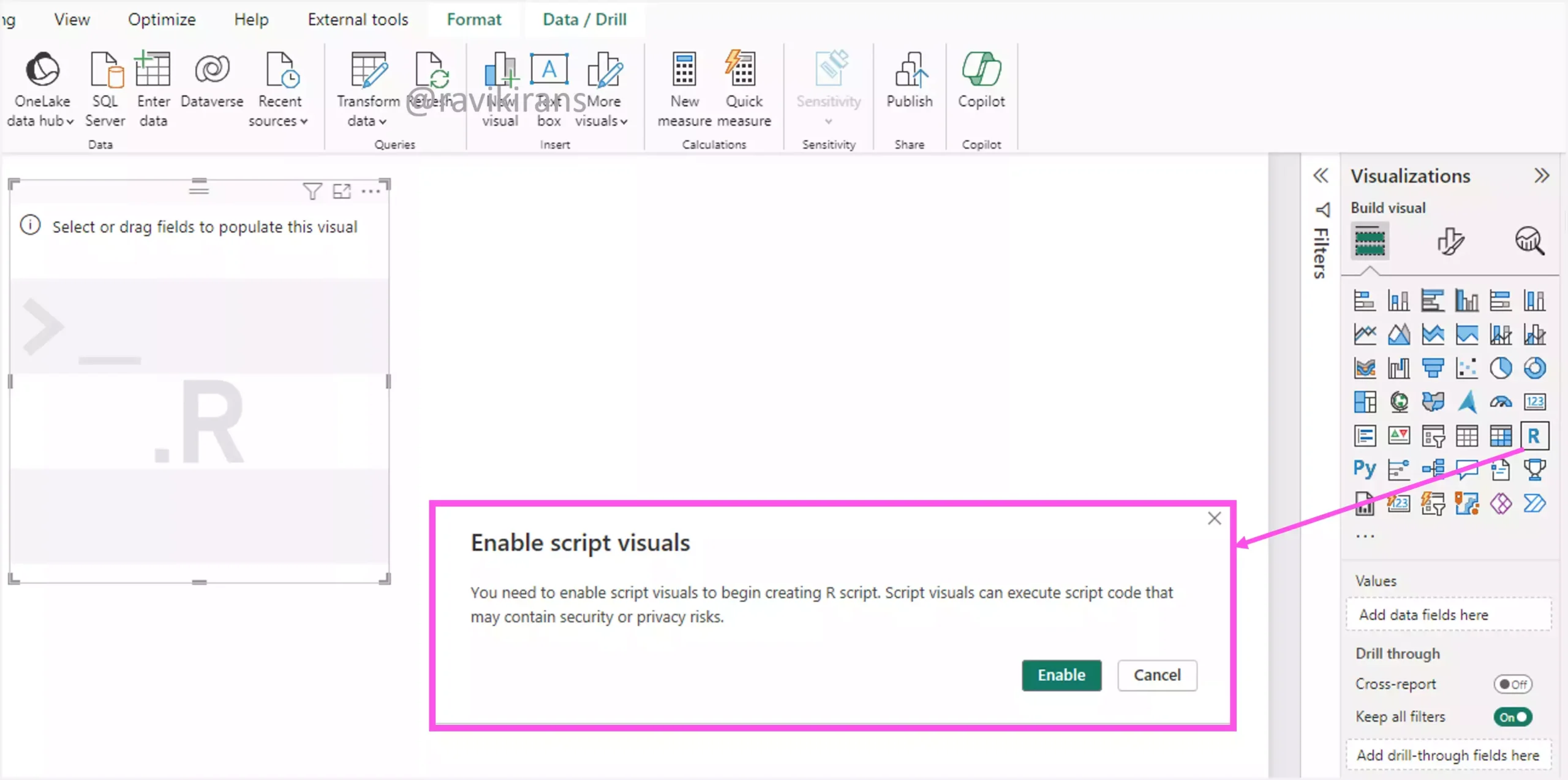
After configuring the scripting options, when you click the R visual, you will get a pop-up to enable script visuals to begin creating R script.
So options A and C cannot be the first step.
Lastly, creating a custom R visual by using Power BI Desktop has no dependency on enabling preview features. Option B is also incorrect.
Q5] You are editing a report in Power BI Desktop.
You need to adjust the behavior of the report by editing interactions.
Which two types of interaction behavior can you change between visuals? Each correct answer presents a complete solution.
a. Drillthrough
b. Expand
c. Filter
d. Highlight
In the below report, select any visual, go to format, and click Edit Interactions. You will see how the interactions between the visuals are set up.
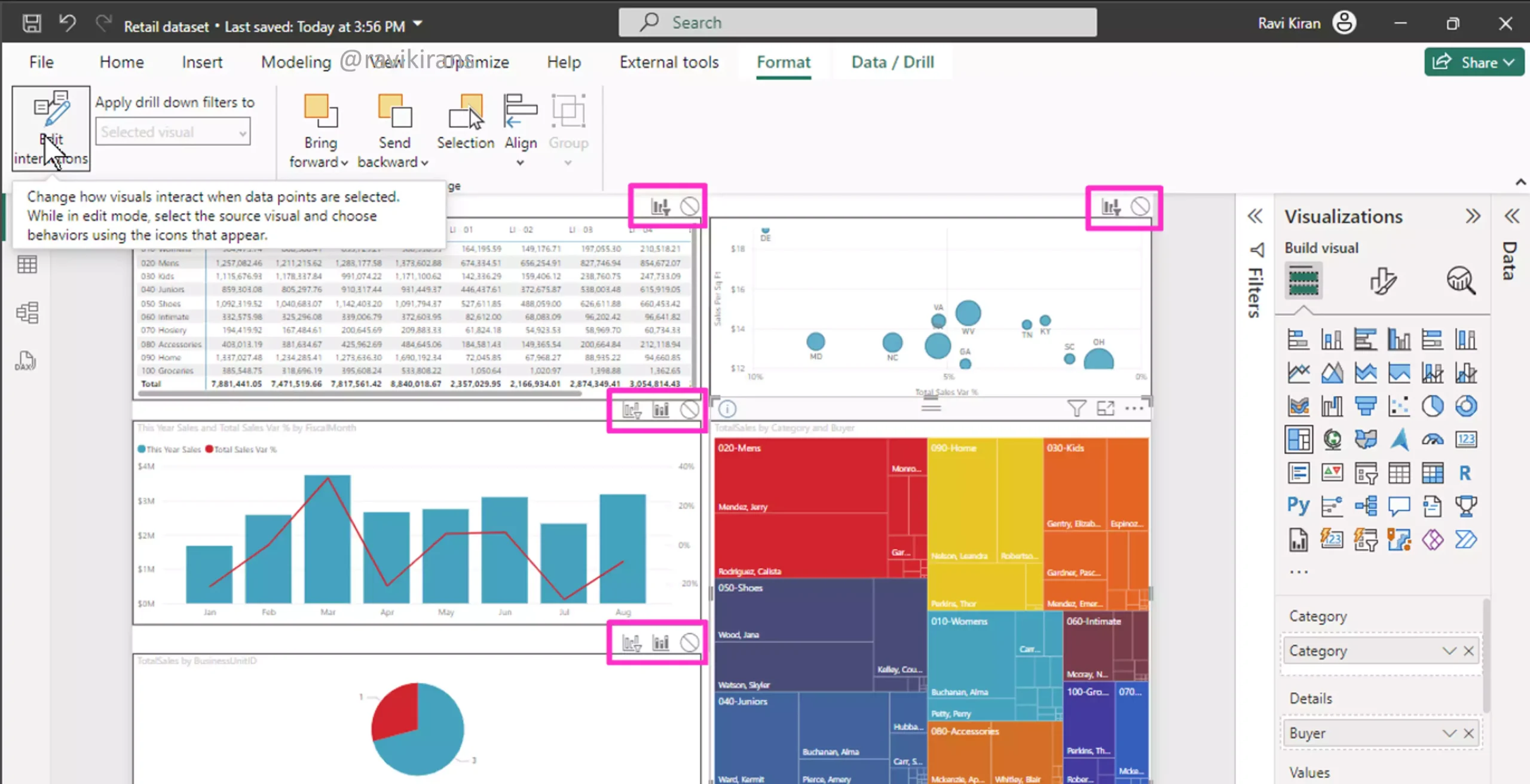
Visuals like tables, Matrix, line charts, or scatter charts can only be cross-filtered. Visuals that have some kind of area like the tree map, pie chart, bar, and column charts can be both cross-filtered and cross-highlighted.
In such visuals, the default interaction is cross-highlight where the irrelevant data of the selection is dimmed-out.
So, you can only change the filter and highlight between visuals. So options C and D are the correct answers.
In visuals like the scatter chart, especially if you have multiple values, you will find the option to expand to the next level, which will display all possible combinations of values for Territory and Chain. For example, for the shown bubble, the territory is MD, and the Chain is Fashions Direct.
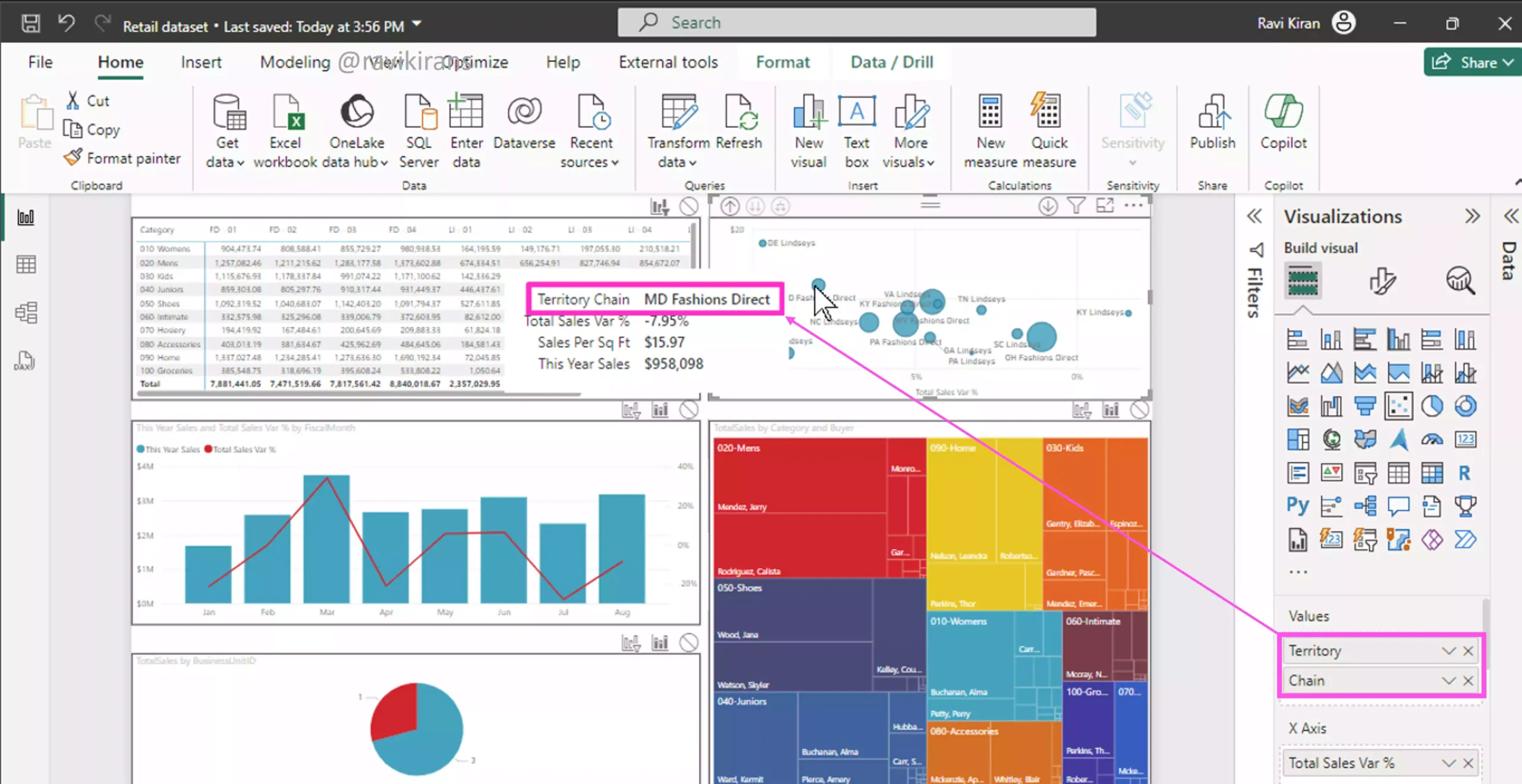
So, Expand is a type of behavior that is seen completely within the visual. Option B is incorrect.
Now to demonstrate drill-through, I have already set up a drill-through page (Q5.1) with a table visual on it. If the pages are correctly set up with a drill-through column (FiscalMonth), you can right-click on the drill-through column (from the main report page) to navigate to the drill-through page. You will get only the filtered results on the drill-through page.
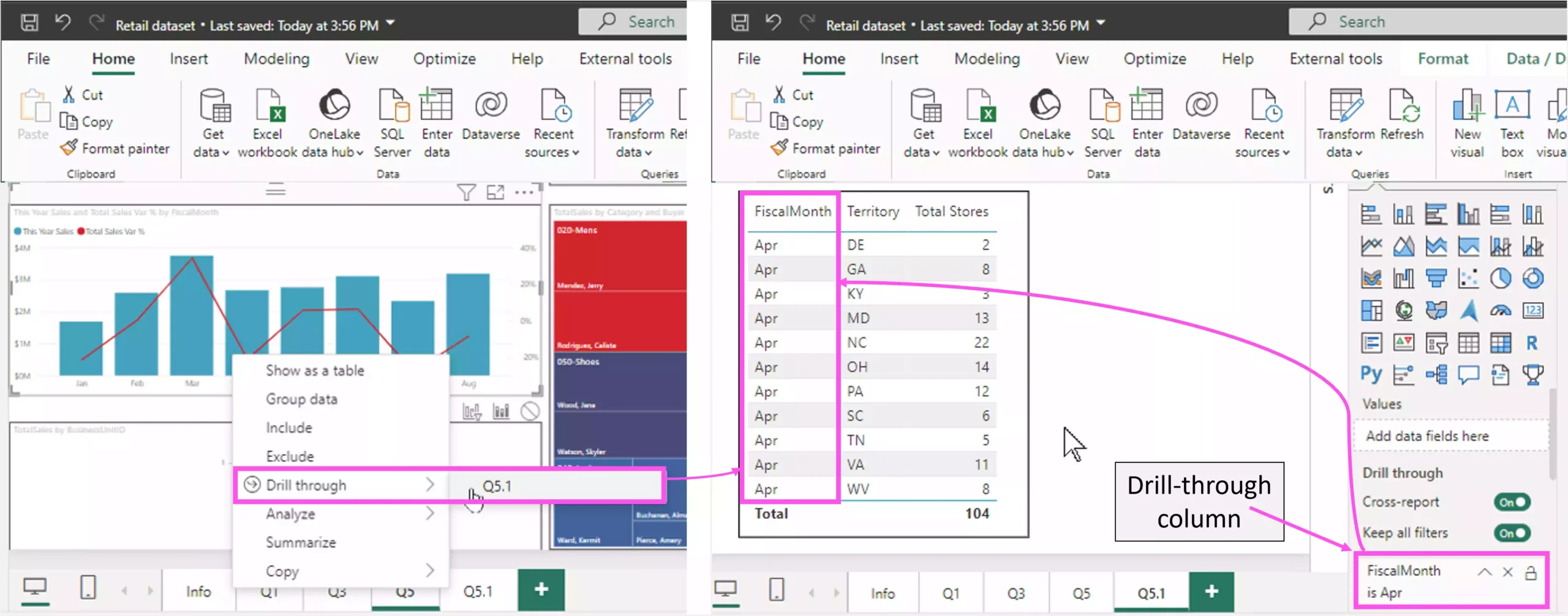
So, drill-through is a behavior that affects across reports.
So lots of different types of interactions you need to know: filter, highlight, expand all levels, go to the next level, drill down, and drill through (the rest are covered in the video). I hope this answer provides a summary of all of them. Be sure to download the Power BI file and play with it.
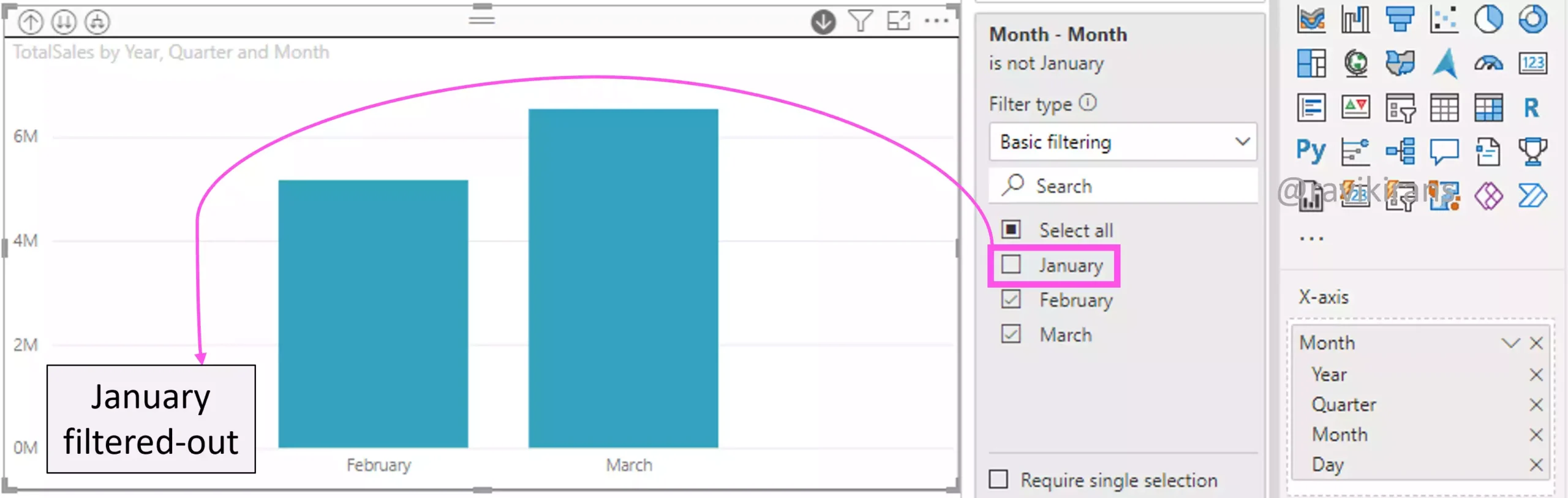
Q6] You are using Power BI Desktop to edit a stacked column chart that displays gross sales data with a date hierarchy that contains year, quarter, month, and day.
You need to prevent users from viewing the hierarchy based on the year.
What should you do?
a. In the Filters pane, add a filter based on the quarter, month, and day.
b. In the Filters pane, add a filter based on the year.
c. In the Format pane, modify the Maximum Range setting.
d. In the Visualization pane, remove the year field from the date hierarchy fields in the X-axis.
To prevent users from viewing the hierarchy based on the year, just remove the year from the date hierarchy field in the Visualization pane. The quarter, month, and day will remain populated and usable.
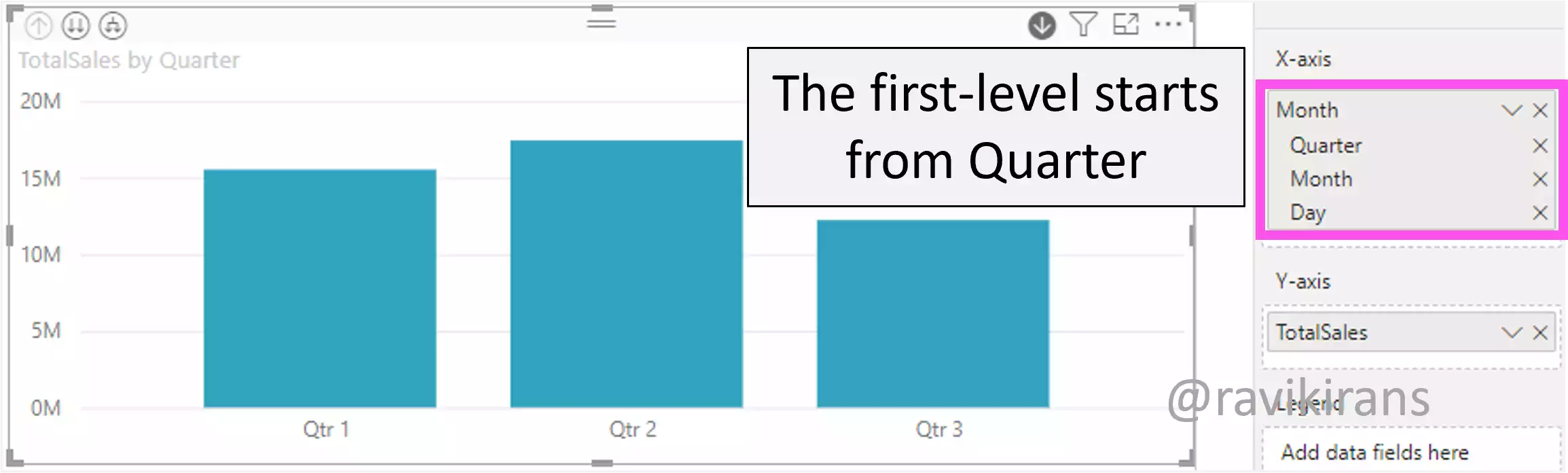
Option D is the correct answer.
Modifying the Maximum Range settings in the Format pane only affects the range of year values displayed in the visual.
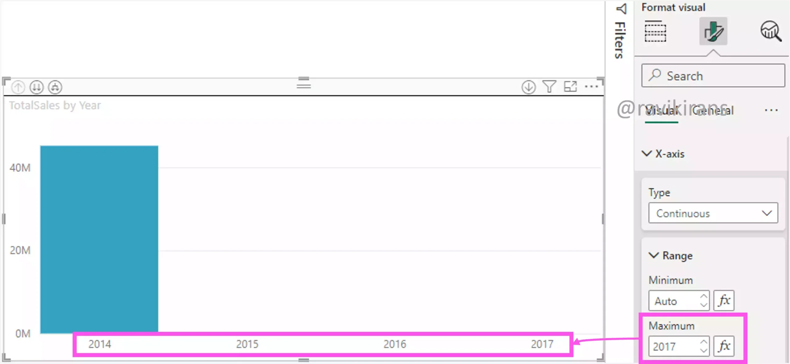
Adding a filter based on year, quarter, month, or day in the Filters pane would filter the values displayed in the visual, not remove a drill-down level.
Q7] You plan to build a Power BI report and set up conditional formatting of data fields.
You need to identify two visuals that support the conditional formatting functionality.
Which two types of visuals should you identify? Each correct answer presents a complete solution.
Select all answers that apply.
a. Guage
b. Matrix
c. Scatter chart
d. Table
e. Treemap
Conditional formatting is possible only for visuals that have a grid of data. For example, the table and the Matrix visual. You can format the background color, font color, or data bars.
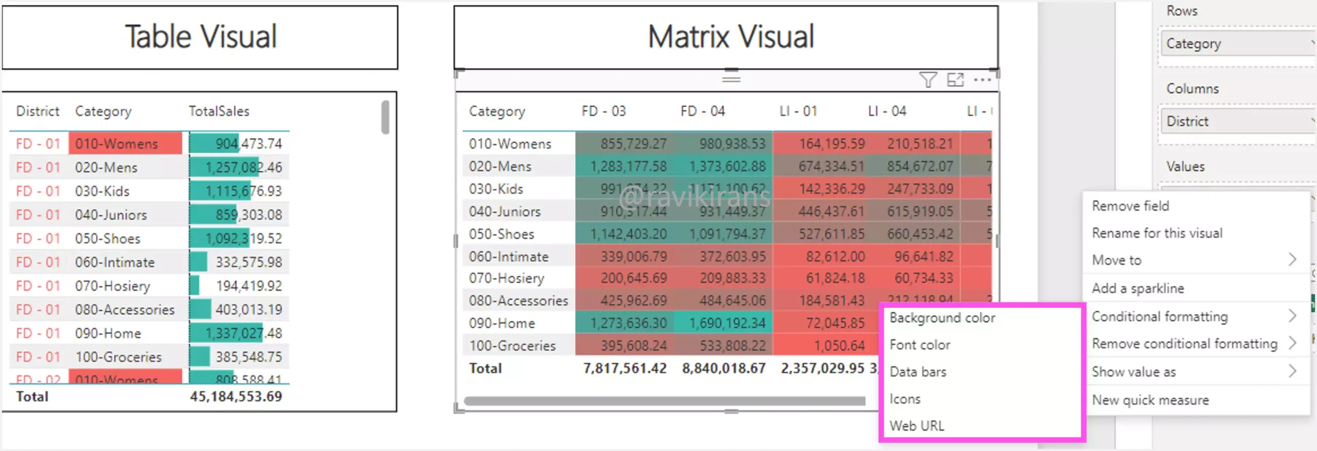
All other visuals do not support conditional formatting.
Reference Link: https://learn.microsoft.com/en-us/power-bi/create-reports/desktop-conditional-table-formatting
Q8] You have a bar chart and column chart visual on a report page. Selecting any column from the bar chart visual filters the column chart data to less than 1% of its unfiltered value.
Which type of visual interaction should be used when the bar chart is filtering the column chart to ensure that you can easily see the data?
a. Expand
b. Drillthrough
c. Filter
d. Highlight
We already discussed earlier that there are only two types of interactions possible between 2 visuals: filter and highlight. So right away, options A and B are incorrect.
I created the below 2 charts that closely mimic the given situation. As discussed earlier, when you turn on Edit interactions between visuals, the default will always be cross-highlight, if the visual supports cross-highlighting.
Let’s select a column in the bar chart that filters the column chart data to less than 1% of its unfiltered value. Here, the highlighted value is less than 1% of the total sales value, perfectly fitting the given situation.
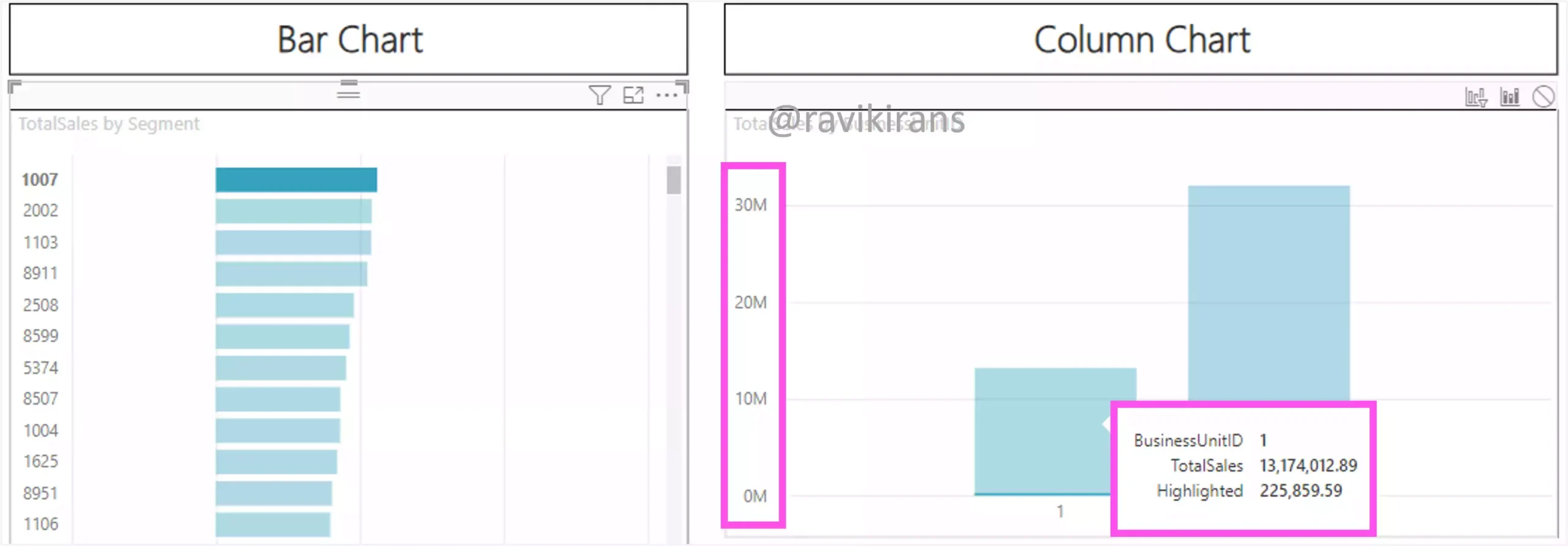
As you can observe, if there is such asymmetry in the data distribution, the report user couldn’t get a sense of the magnitude of the filtered value from the y-axis label.
In such cases, cross-filtering would be a better solution as the Y-axis labels are reevaluated according to the data being displayed.
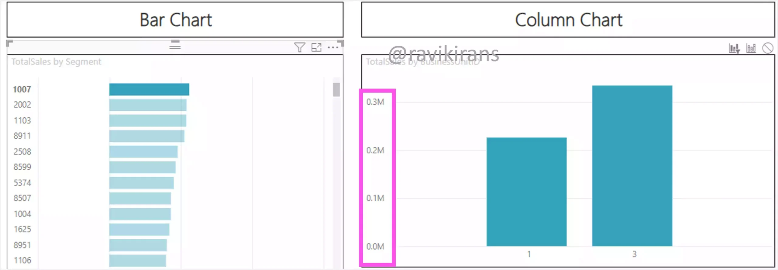
Option C is the correct answer.
Q9] You have a visual that is being cross-highlighted.
By default, what data will be displayed in a report tooltip?
a. A report page tooltip with cross-highlighted data
b. Both the un-filtered and filtered (cross-highlighted) data
c. The filtered (cross-highlighted) data
d. The un-filtered (non-cross-highlighted) total data
When you place your cursor on the visual that’s cross-highlighted, you will see the total value and the highlighted data. The tooltip doesn’t display any values for the dimmed-out or the non-cross-highlighted data.
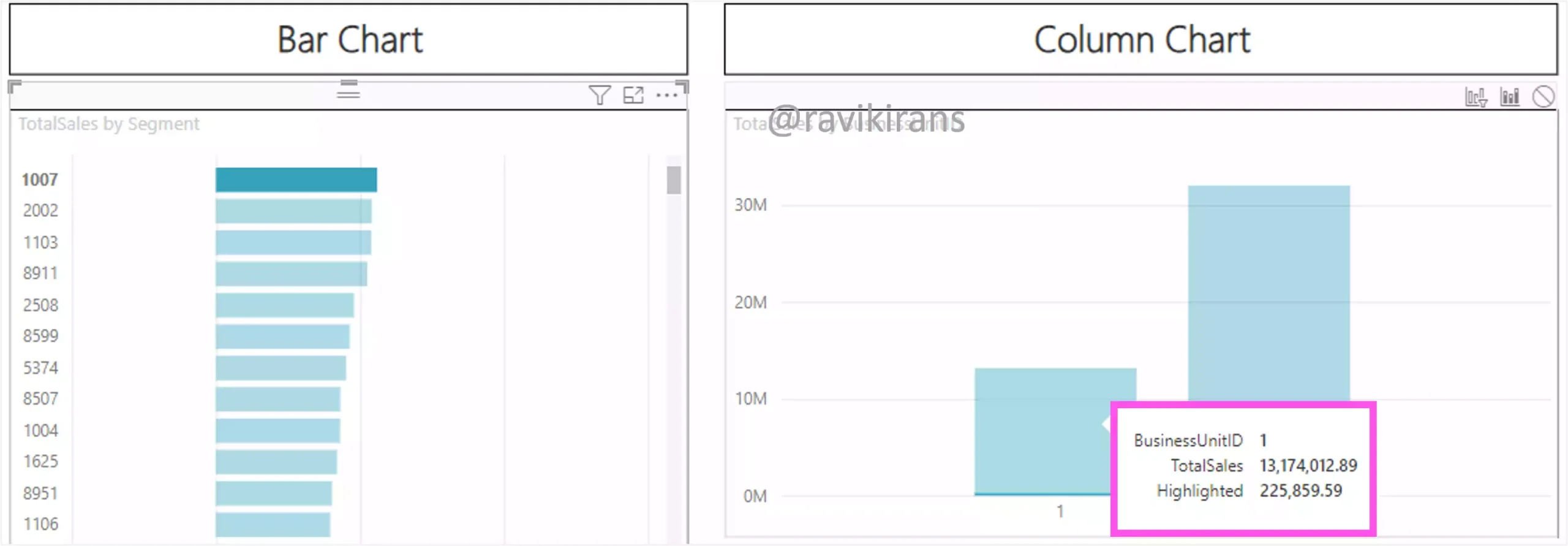
Option C is the correct answer.
A report tooltip, which displays visually rich report pages as tooltips, is something you need to create manually and is not automatically available. Option A is incorrect.
Reference Link: https://learn.microsoft.com/en-us/power-bi/create-reports/desktop-tooltips
Q10] You plan to create a report in Power BI Desktop that will display the relationship between the number of orders and the number of orders shipped by product category.
You need to identify the visual that will clearly identify outliers in the data set by displaying them away from the bulk of data.
Which visual should you use?
a. Card
b. Gauge
c. Scatter
d. Treemap
A scatter chart is best suitable for identifying outliers in the data set.
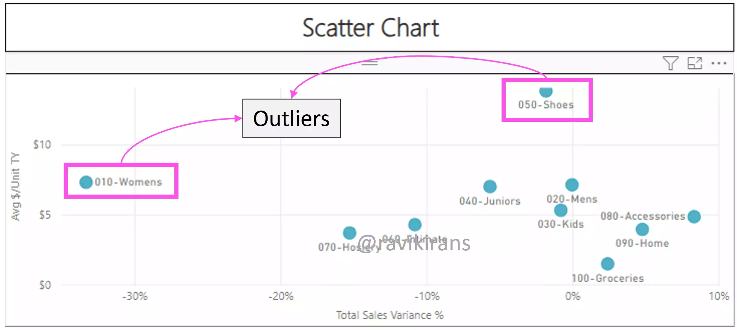
Option C is the correct answer.
Card visual displays a single data point. A tree map visual displays data as a set of nested rectangles. And, a gauge visual displays a circular arc including a single value that measures progress toward a goal.
Reference Links: https://www.quanthub.com/power-bi-identifying-outliers/
https://learn.microsoft.com/en-us/power-bi/visuals/power-bi-visualization-card?tabs=powerbi-desktop
Download the PL-300 Practice Test PBIX lab files from GitHub.
Follow Me to Receive Updates on the PL-300 Exam
Want to be notified as soon as I post? Subscribe to the RSS feed / leave your email address in the subscribe section. Share the article to your social networks with the below links so it can benefit others.